Sunday 30 November 2014

Academic Poster|COP3

One of this module requirements is to create an academic poster. After presentation I did a quite google search to find a template for the poster and gain more understanding of why and how to make one.
This website came very handy, as it got templates shown to us during presentation.
Academic poster (also known as a conference poster or chart) is a large-format piece of paper (or a wall-mounted monitor) that presents all the research to the vast number of peers. Text should be somewhere between 500 to 800 words, clearly arrange and possible to read in 5 minutes.
There are few categories that should be included. Obvious one is the title header, that will inform the audience of what your research is about and will use biggest font. Title shouldn't be longer than two lines. There are 7 other categories that should be included:
  • Introduction - a brief introduction to the topic of the research, which will inform the audience about what you are doing;
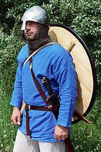
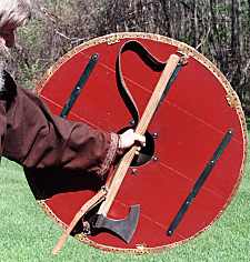
  • Materials and Methods - brief explanation of tools and approches used;
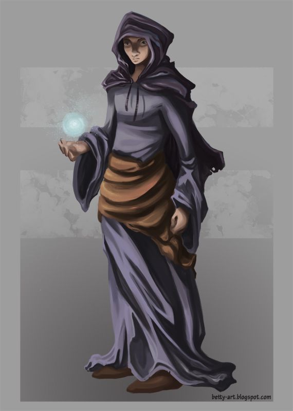
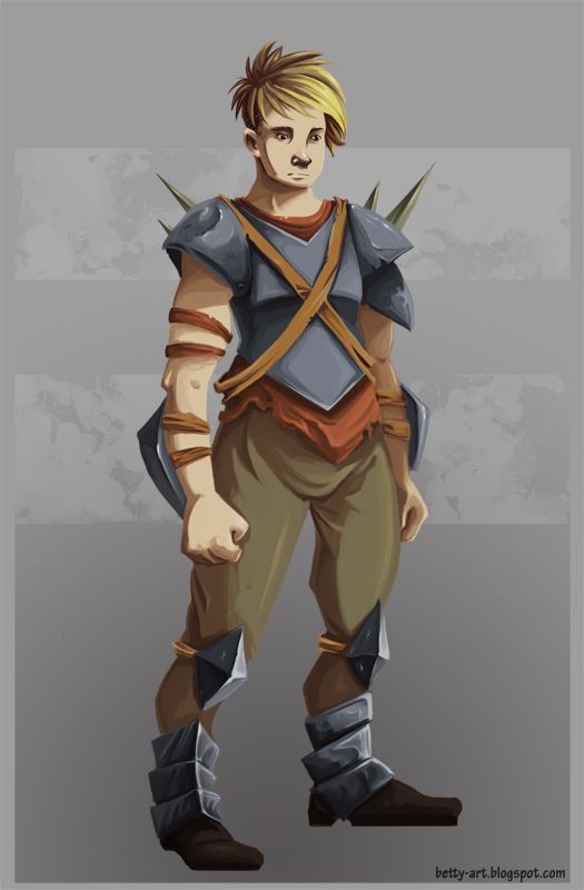
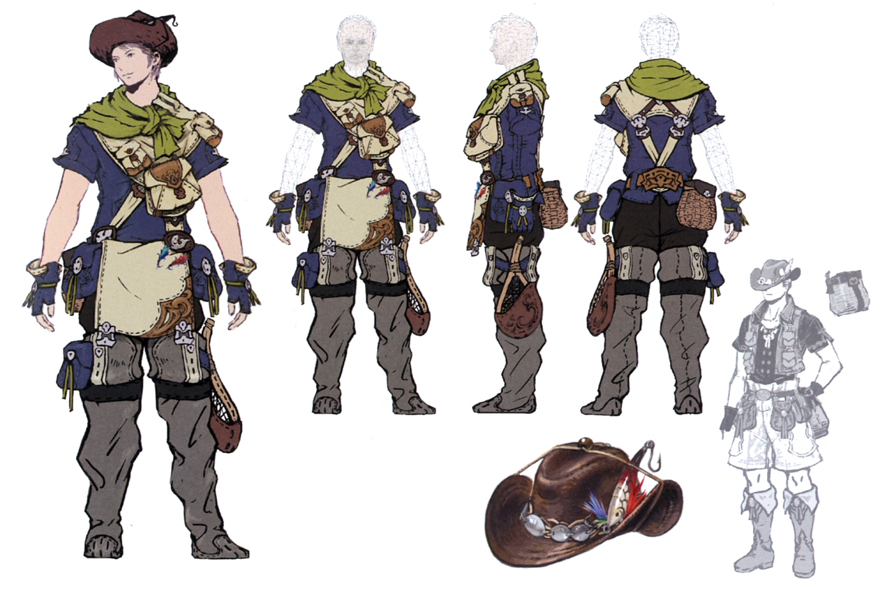
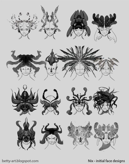
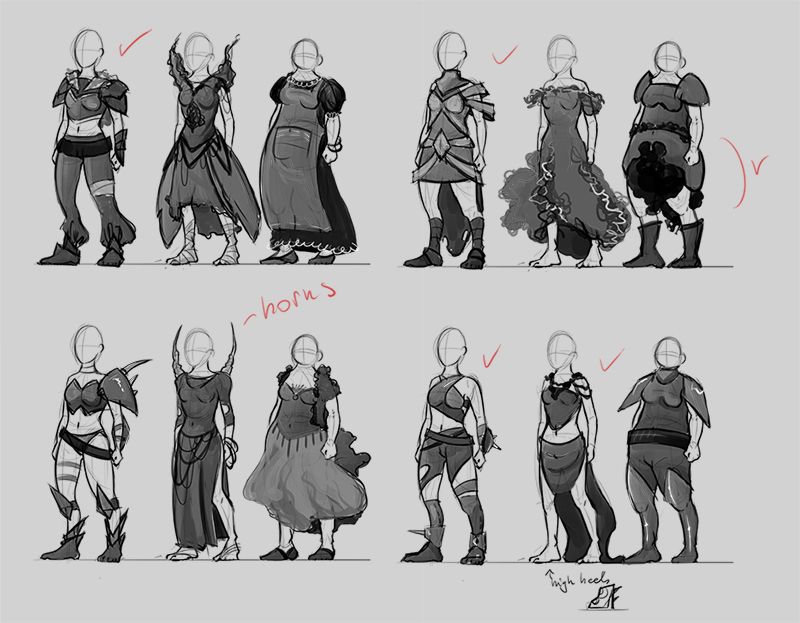
  • Results - visual and written explanation of the research outcomes, can show development stages (in case of my poster it presented a stages in designing a character concept);
  • Conclusions - a summary of the results and goals achieved, can also include the mention of the future direction;
  • Bibliography - a small list of books that were used, especialy important if some content within the poster was cited;
  • Acknowledgements - any special mentions to the people that help during the research;
  • Further information - can be in a form of QR code or a link to the website that will direct audience to the additional research/information.
Other thing that should be kept in mind when creating poster is the use of correct font - it should be easy to read ( Helvetica for header, Palatino, or other serif font, for body text; don't use anything like Comic Sans or Curlz) and spacing (it makes poster easier to read and understand).

Thursday 27 November 2014

Mage character concept|COP3

Finished character concept of Mage. When compared to the initial thumbnails, his look changed slightly. I've tried to made his robes a bit shorter, but still keep them long enough to project this stereotypical look of fantasy magicians.
The part I'm realy unhappy with is face - strangely long and a bit alien-like. He doesn't carry any props, which I should add, like a spell book or wand.
I tried to consider colour symbolism, which explains a bit why his robes are blue and purple. Blue is considered with spirituality (color of Virgin Mary), youth, communication abilities, while purple is seen as a colour assosiated with meditation, magic, mystery and royalty. Since purple is a mixture of red and blue, it can convey a very powerful message. The fabric that goes around his waist is somewhere between gold and yellow. Both of those colors symbolise wisdom, wealth and intellectual energy. Moreover, all of these colours been heavily used throughtout the ages in art across Europe and have a deep religious connotations.

Wednesday 26 November 2014

Male Warrior Concept-changes|COP3

During my conversation with Sandra I got few things pointed out that should be changed/improved.

Warrior concept feedback:
  • shield and sword - belt across the chest indicates that there should be a shield attached (especially since I haven't specify what kind of weapon he is using). Ref pics:
  • more visible fabric that goes under the metal shoulder guards, mostly to indicate that metal isn't directly on the skin;
  • forearm metal gauntlets should be more oval and follow the shape of the arm. Ref pic:
  • similarly to gauntles, greaves should follow the shape of legs. Ref pic:
 I've applied mentioned changes to the concept and can see how much it improved the concept.

Tuesday 25 November 2014

Feedback to my concepts|COP3

As I kept on drawing my character concepts I asked various people for feedback. Sandra Duchiewicz (concept artist at Creative Assembly) and Weronika Daniel (freelance artist) were my main source for quality comments and suggestions, but I also took it a bit further and posted some of my initial work onto LevelUp facebook group. Unfortunately I didn't get as much valuable feedback as I expected, ''likes'' are nice, but unhelpful. However posting my finished warrior concept brought more good advice.

When painting this concept I flipped canvas countless times as I felt there was something off with it. However, I was unable to figure out what was wrong. And this is where feedback from other people came in handy. Things others pointed out were:
  • spikes on his armour aren't in perspective;
  • metal thing on his knee isn't following leg;
  • right arm is too long;
I'm going to try and fix those mistakes later, for now I prefer to work on other pieces and get a break from this work - it'll be easier for me to see mistakes with the fresh eye.

I've started working on mage concept and based on Sandra's advice I've decided to cut his robes a bit shorter and avoid drawing tons of floating fabric behind him, as it would be really hard to put into game (extra rig and animations). I've also showed WIP stages to avoid really obvious mistakes. Even though I'm doing characters, they're outside of my comfort zone, not only in terms of style (painterly, no lineart) but also an unusual for me subject matter (first of all I rarely draw fantasy or if I do it's more stylized; men.. I don't really draw men that often; or more realistic faces that don't have silly expressions).

ShowcaseSpectacular|PPP3

Showcase Spectacular took place at the Corn Exchange between 22-23 of November. I took part together with students from other courses (illustration, graphic design, fine art). Thanks to the awesome guys from JuJu and James from Student Union we got a really neat gallery space and a selling table. Our task was to put exhibition together, come up with a name, promotion and posters. Our group went with the LCA Collective name, which works realy good, since we are all Leeds Colege of Art students, with the range of work (watercolours pieces, massive oil painting, funky marker drawings, embroidery).

 On Friday before the event we went down to Corn Exchange to mount our work. Since the exhibitions I did last year, it was fairly easy for me, as I already got all my work framed. Also this year I had my business cards which I placed right next to my work (and on the table).  I tried to have a good variety of pieces on the wall, some of them Christmas themed. I've also made bunch of cards and prints to sell.

Corn Exchange was quite busy during the weekend and it was a really good opportunity for me to talk to other people, give business cards out (in hope for future commisions), chat with fellow creatives that had stalls next to us. I definately made some new connections, had tons of fun and would love it to do it again in the future. The only thing that was a bit upsetting was the placement of our stall - most of the people seemed to stick only with the upper floor or, if they went downstairs, to the inner ring of stalls, mostly consisting jewelry. We felt a bit out of the way and when in the end we gathered a good crowd fire alarm went on and scared poeple off. Oh well, that was just very unlucky. Still, compare to the last year (I did Showcase as a part of RAG event to support Yorkshire Air Ambulance) it was much more better and gave me extra confidence.

Sunday 23 November 2014

Change of direction with the Practical Element|COP3

I've explained the world settings in my previous posts and wrote a little bit about each class from each fraction. So far I've been concentrating pretty much on the Human race and decided to leave Nixes out for now. I only did some initial concepts for that race and, personally, I don't want it to be rushed and not well thought through. I'll use concepts for Human warriors as a source of important feedback and critiques and try to change them as I go. That way I'll be able to analise couple of concepts deeper and gain more knowladge from it, rather than just creating a lot of concepts without meaning.
With this in mind, there is still nothing stopping me from developing this project futher in my spare time, outside the Context of Practice module.

Wednesday 19 November 2014

Primary research - asking questions|COP3

Maybe I'll never understand how twitter works, but sometimes I find it very helpful in approaching people. I came across the article on gamasutra website which led me to those two amazing chaps specilizing in gamefication.
Rich Wallace  and Andrzej Marczewski were kind enough to answer few questions I've prepared.
  1.  When playing games, what elements would you describe as the most fun? R.W. : Collaboration with friends is always key for me.  I'm currently playing Portal 2 with a friend and solving puzzles together is great fun! A.M. : I like to explore a world, I love seeing where the edges are of the world.
  2.  Is character gender important for you? R.W. : None.  I don't mind what I play as. A.M. : No
  3. When creating avatar with character editor, what do you try to achive? R.W. : Depends on the game.  Sometimes it is nice to try to create yourself (ideal self) but in others inspiration comes from everyone.  I once had a character in City of Heroes call Samurai Jeff (based on Samurai Jack on Cartoon Network). A.M. : When I create a characters look, I usually try to make it as much like me as is possible.
  4. Do you identify with your character? R.W. : Depends on the story/background and their progression. A.M. : I try to, especially if I can make them look like me!
  5. What would you describe as a ''cool'' character design? R.W. : Difficult.  Any ability to customise your avatar is cool! A.M. : Cool character design is anything that allows me freedom to create what I want. I like to be able to add things like tattoos and get into the fine detail of what is worn.


For both character gender is unimportant, it's interesting gameplay, possible collaboration with friends, ability to explore the game space that keeps them playing. Personally, I find Rich Wallace answer to the second question especially good, since, instead of saying male or female he uses 'what' which could also indicate any other races/genders (e.g. Abe from Oddworld). However, character customization is important, just the use of it can be different. In Rich Wallace case it's all down to the type of game he is playing, while Andrzej Marczewski likes to make character similar to himself. It also impacts his identification with the avatar during the play. Moreover, both of them likes to change and add things to the character, freedom when customizing is an important factor.

Monday 17 November 2014

Alien Isolation: From Film to Game|PPP3

On Friday 14th the talk with writers of Alien: Isolation took place in college. Organised by Game Republic and led by Jamie Sefton, event was a great opportunity to listen to 3 creatives from Creative Assembly.
Alistair Hope (creative lead), Dion Lay (writer) and Will Porter (writer) chatted about their challenges while working on such big franchise as Alien and creating immersive world. They're all big movie fans and with this project they tried to keep that 70's vibe, give game same feeling as the first film. In order to achive that, they had to create a gritty sci-fi future, with it's own propaganda and technology. We had a little insight into the concept art that was created for this game, character designs and enviroments of the space station (drawn with markers). Writing dialogues for the robots sounded like a lot of fun. It was clear that all three guys were really passionate about this title and it's visible in a game.
Alien: Isolation is a survival horror, game about human instincts. Player spends a lot of time hiding and avoiding Alien, ammunition is limited and every move has to carefully planned and is never save. I haven't played the game yet, but after this talk, I became even more interested in it.

Saturday 15 November 2014

Matt Forsythe, Cameron Steward and Babs Tarr|PPP3

On a 13th of November I've attended a brilliant event organised by Creative Networks and Thought Bubble Festival. Guest speakers were Matt Forsythe, Babs Tarr and Cameron Stewart (instead of Adam Hughes).

Matt Forsythe is a comic artist, who worked on Adventure Time series for 2 years. He didn't went to art school and have a degree in political science. However he was motivated and determined enough to improve his drawing skills and used art forum to get feedback and crits. Ojingogo was the first graphic novel from him that got published, followed by Jinchalo. Made during his stay in Korea, Ojingogo is an abstract, wordless comic with a very cute character. What's really interesting is the fact that this little character was drawn on a pitch for AT. Speaking of which, Adventure Time is a storyboard driven show (like Sponge Bob Square Pants). It takes around 5 weeks to complete storyboard which is then made into an animatic by storyboard revision team (which basically works out which bits needs to be animated, record voices, test pacing of the episode). Completed storyboard, animatic and additional notes (like character/color charts) are then sent to Korea, where the show is animated.
Matt's tumblr contains a lot of material from his work on Adventure Time and this talk gave me a lot of insight into how animated shows are produced. Shame I wasn't able to chat with him (swarm of other people got before me). Well, at least I tweeted a little pencil sketch I did during the event to him. ;)

Cameron Stewart is a Canadian comic book artist who worked for DC, Marvel and Dark Horse Comics, currently working on Batgirl (together with Babs) and Fight Club 2. He also didn't went to art school, but practiced a lot. Worked as a storyboarder on Men in Black animated series and was asked to draw comics. His signature 'thing' are action sequences and fighting scenes, a lot of time is devoted into getting a right flow of the panels (sometimes even 15 sqeezed onto one page). Sin Titulo is his personal, award-winning comic, on which he worked during his spare time. Published online between 2007-2012, it was also released in a book form by Dark Horse Comics in several languages. Sin Titulo is a proof of how important it's to work on personal, side projects, even if it's only few hours a week.

Babs Tarr is a illustrator and co-artist on Batgirl. For a change, she went to the artschool in Baltimore and graduated with degree in illustration. She enjoyes working in different media and did painting, concept art, toy design, editorial illustrations (fashion ilusts). Her advice was to give employers more than they expect, have online presents in some shape and form (portfolio, blog, twitter, etc.) and.. do fanart!
She was actualy ther only person I've managed to chat with and even got a little Batgirl scribble from her.

Style Inspiration|COP3

Before processing any futher with my practical element, I had to ask myself one very important question - what style am I going to draw my concepts? Previously mentioned, that eastern MMORPGs were big inspiration for me and they still are. However, since I also want to include at least couple of concepts in my portfolio, I'll be better off painting them in a style thats so typical for western games, such as World of Warcraft. Blizzard's artists do the amazing job at rendering characters, same goes to the Riot Games and their insane splash art for League of Legends. Should I mention begging sequence of the Overwatch trailer? As much as I love jRPGs (and MMOs), artwork for these titles is, to put it simply, manga. Big eyes, small nose, cell or soft-shaded. And, if we look at Tetsuya Nomura for example, designs can be insane and amazing, but in the same time anatomy is very twisted. Unreal. Unhuman. It appears mostly to eastern audience and thats were people with those kind of skills get jobs. In terms of companies, Applibot and their card games are breaking this rule, but, in the end, manga is not the style I'm after.
So, painterly style, rimlight, crazy colors. In terms of design I'll still go back to the titles such as Final Fantasy or Ragnarok, but when it comes down to the technical aspect of drawing it's going to be more like WoW or LoL. That's the goal.

Thursday 13 November 2014

After Effects Workshop|PPP3

After Effects Workshop notes.

Since the change in the college network this year, first thing that needs to be done is to set a disk cache to scratch, which allows After Effects runs smoothly and stops it from sending massive files across the network (which slows it down).
Another thing worth remembering is a good housekeeping when comes to creating assets in Photoshop - make sure the painting is much more larger than the HD setting (4-5 times bigger), which allows plenty of movement for the digital camera (panning, zooming), also NAME your layers correctly while working in Photoshop.


First part of workshop was just a refresher of the After Effects basics, like 3D layers, camera movements, use of depth of field and motion blur. I've played with all those tool last year and, surprisingly, remembered everything (but it's always good to get another reminder).


Puppet tool and using pins was the second part of the workshop.
Puppet starch tool - makes mesh around the pin inflexible, not as bendy as with just using pins, keeps object straight.
Overlap tool - similar to starch tool, allows to mark the areas of the asset to overlap (go in front of each other or behind). Change of extend and in front values impacts the area effected by tool. Overlap tool is key frame-able in terms of position (so one thing can go in front of the other and then go behind).

Another useful tip I've learned today was that by holding down command (alt for pc) button and pin that you want to control, the little stop watch symbol will appear and record movement of the pin, which saves time when key framing (no need to do it manually). Good for little object within the composition, gives a really funky, cartoon-y look.

Tuesday 11 November 2014

Pose references|COP3

Since establishing overall look of the human characters I've moved onto more refined concepts. For this stage I've searched bunch of my favourite stocks on Deviantart for the pose reference.

Senshi-Stock has enourmous pose library and I use it from time to time. I've picked couple of differrent photos for the warrior and dancer (1 , 2 , 3 ).
While I tried to keep dancer's pose feel feminine and delicate, I went completly opposite direction with the warrior - strong stance that shows power and energy.

Mjranum's classical nudes section provides a lot of really good pose references for Nix race - very eerie, mysterious, unnatural. Most of his stock models are dressed in costumes or at least in cloth, which will also help me with drawing drapery. Again, I was able to find useful poses for warrior and dancer ( 1 , 2 , 3 ).

Random-Acts-Stock not only have a great pose library but also tons of amazing shots of ruins and Medieval architecture. Those might not come as handy as other ones, but will definately influence my work, since I'm already being heavily inspired by Medieval towns and castles (as mentioned before, mostly Germany). There were few good shots, like 1 , 2 , 3 portraying strong character.

I'll go back to MariaAmanda stock when working on Nix race as it has a large library of dreamy dancing poses.

Monday 10 November 2014

Testing Cintiq 24HD|PPP3

This year we got two Wacom Cintiqs 24HD and I've so much fun testing and using one of them. I've to admit, first encounter was rather strange as I've never used Cintiq before - had to watch couple of YT tutorials on setting it up. Quickly, I've became familiar with it and it made my work flow a bit faster.

Setting up express keys in itself is a fairly easy task, however deciding on which keys are the most important is a bit harder. After years of using Graphire 4 along with the keyboard (and still doing that at home) I've got a little bit of trouble getting used to buttons lined next to the display. Even after setting up keys I still find some other useful shortcuts and keep on reaching for keyboard. Toggle display is extremly useful for zooming in/out, changing brush/eraser size and rotating canves.

Drawing on Cintiq feels a bit.. weird. It's like putting a thick glass over your paper and then trying to draw. Yet, the disconnection between hand movements and screen is much smaller than when using traditional tablet like Graphire. And thats for the pros of the Cintiq.
On the down side screen heats up pretty quickly, after hour and half of using bottom part gets a bit warm. Other annoying thing is the reflection from the lights. Maybe it's due to the fact I wear glasses, but working indark seems like a perfect option for me. No glare. In one of the rooms I had to figure out which lights I can have switched on in order to see what's happening on the screen.
Another thing worth mentioning is the lack of dual monitor setting, mostly due to the space issues. It'd be extremly useful to have another screen hooked up and used just for reference images or checking brief. But then, I'd probably end up with a wrist injury in no time (since it feels like I can work longer on it without breaks than on normal tablet).
I'm still unsure whetever I'd buy a Cintiq in a future or not. It's probably a good investment, although I'm still vary of some issues, like the glare issue. Moreover, I've heard from some artists that used previous models, that the screen was prone to scratches from the pen. So, just let's hope my Graphire will last me for another couple of years (at least).

Initial Nix face exploration|COP3

Nixe is a race of water creatures that lives in ponds and rivers. As described in my previous post, some of them can shapeshift into water wyrms. In terms of anatomy, they're not that much different to humans, have a same number of limbs, walk on two legs, etc. However, due to the fact that water is a huge part of their habitat, some changes in their facial features occured along the evolution. And this important part of their physique I've decided to explore and establish first.
I've started by gathering bunch of reference images, photos of various sea creatures (like jelly fish and sea dragon), mostly looking for interesting shapes, colours and textures. I'm not after a specific animal or look and wasn't limiting myself just to the water creatures, but also looked at some bugs and beetles (since they're symmetrical and have interesting patterns).

To create a perfect (or almost perfect) symmetry I've drawn only half of the design and mirrored it. In case of some I used a different approach that was recently shown by Feng Zhu in a Level Up session 50. With lasso tool I've quickly marked a random area of from a reference photo, copied it, turned saturation down and played with tool such as 'perspective', 'scale' and 'warp'. This way I was able to create even more bizzare and uncanny designs and concentrate more on overall shape and form, rather than on single brush stroke.
I believe this approach worked very well for designing a water creature.

I've created 8 different options for each male and female Nix. From that I've narrowed it down to 6 designs that I'll explore a bit futher and use in final concept. I'm still unsure whetever they should have hair or not, maybe leaving them bold with just tentacle like bits would work great. Probably, I'd try both options just to see what works best.

Wednesday 5 November 2014

Hairstyles|COP3

Creating a rough thumbnails for the character haircuts was another step. I've started with very basic shapes first and then, with second batch, I tried to make them a bit more refine.
I used different face shapes and played a bit with the idea of ridiculous hairstyles, that doesn't follow rules of gravity. With the second sey of 12 I used the same, generic face. I' ve marked couple of different options, which I'll use in the later stage (when painting finished concept).


Tuesday 4 November 2014

Female warrior thumbnails|COP3

Since establishing a clear idea of the world and characters I'm going to design for the practical element, I had moved to thecreating female warrior and dancer concepts. First step was to draw 3 different body types: athletic (warrior), skinny (dancer) and chubby/fluffy (warrior or a housewife NPC type of character). Then I proceed with creating costumes. I copied the figure layer 4 times and did 6 different ideas for warrior (4 on athletic figure and 2 for chubby gal) and 4 for dancer.
I've kept going back to the moodboards created at the beginning for inspiration and ideas. All above sketches are very loose and quick, roughly spent hour on all of them. I tried to avoid overdetailing and concentrate on big forms that will make my characters stand out. I've marked couple of different options in red and these are the designs I'm going to develop futher - so in case of the warrior I'll take a little bit from all 4 designs and for dancer I'll try to incorporate long, spiky horns within a loose dress design. I've decided to abandon half-naked warrior design since it seem to be too cliche and totally impractical (although I do like her boots).
Later stages will involve working more on the designs, refining them, adding colours and finally producing a finished, portfolio worth, pieces.

Saturday 1 November 2014

Balancing out classes|COP3

After posting more info about 2 races I've decided to map out exactly how they will work within game space. Since player would be able to choose character from both races, they need to be balanced and give equal chances of winning.

Human classes:
  • warrior - male/female; equipped with either sword or axe, can also carry shield (better defense but agility and speed goes down);
  • mage - male; holds powerful spells, pretty much useless in close combat in human form; after reaching specific level can use a shapeshifting spell and change into a wyrm and hold this form for limited amount of time;
  • dancer - female; offensive attacks, status effects and healing spells;
Nixe classes:
  • warrior - male; equipped with spear; high speed and agility, however when this abilities are overused stamina goes down;
  • shapeshifters - male/female; can shapeshift into a water-wyrm for limited amount of time;
  • bard - female; use of songs to cast various spells, including hipnosis.
I think the above settings would give the equal chances for win, as well as give a bit of choice in terms of different classes and their roles on battlefield. Additionally, I want to avoid marking one of the races as 'bad guys'. Story can be experience from both sides, Nixes are just trying to protect their habitat and Humans are trying to improve their knowladge of the world and use the technology. Initially both races lived in peace, however some unfortunate events destroyed that.