I used a basic round brush from default Photoshop set and spent couple of minutes on each silhouette. I particularly liked numbers: 3, 9 and 16. In the end I used number 16 as it's the most appealing to me, also have a really organic feel too it. As the space ship is going to be shown only from one angle I'm not planning on drawing the orthographic views of it, however I'll paint a more detailed version of it to make modeling much more easier.

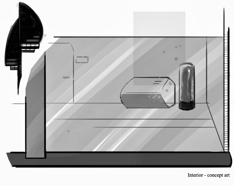
I also started working slowly on the interior concepts. As the action will be happening on the corridor, I wanted to make it look really long, yet minimalistic and clear (more of a Mass Effect than Dead Space look ;)). Concept on the left hand side is very basic and doesn't really present well what I want to achieve. I'm going to work interiors next, as the character concept art is done.
No comments:
Post a Comment