As I'm in charge of designing spaceship interiors, I've looked at different pieces of concept art done by various artists on cgHub website. Action of our cutscene will take place in one of the corridors and I wanted to make it look really long (which would indicate the massive size of space ship itself). However, I want to also keep it clean and minimalistic. Examples, I've gathered below, featuring futuristic corridors and room concepts.
Syndicate concept by Axel Torvenius.
- clean design
- spacious
Thumbnail interiors for Halo by Shae Shatz.
- good sense of space
- various angles
- futuristic designs
Concept for Mass Effect 3 by Brian Sum.
- good lighting
- space
Space corridor by Maciej Kuciara.
- sense of space
- clean and minimalistic
Monday, 31 March 2014
Friday, 28 March 2014
Spaceship conceptart01|Machinima
Action of our story will take place inside the space ship so I quickly sketched few thumbnails to test different shapes. I was after creating an organic looking design, which would also match the style of the characters. Various types of sea shells were one of my main inspirations.
I used a basic round brush from default Photoshop set and spent couple of minutes on each silhouette. I particularly liked numbers: 3, 9 and 16. In the end I used number 16 as it's the most appealing to me, also have a really organic feel too it. As the space ship is going to be shown only from one angle I'm not planning on drawing the orthographic views of it, however I'll paint a more detailed version of it to make modeling much more easier.
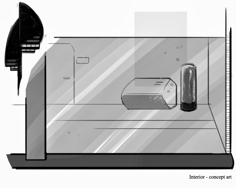
I also started working slowly on the interior concepts. As the action will be happening on the corridor, I wanted to make it look really long, yet minimalistic and clear (more of a Mass Effect than Dead Space look ;)). Concept on the left hand side is very basic and doesn't really present well what I want to achieve. I'm going to work interiors next, as the character concept art is done.
I used a basic round brush from default Photoshop set and spent couple of minutes on each silhouette. I particularly liked numbers: 3, 9 and 16. In the end I used number 16 as it's the most appealing to me, also have a really organic feel too it. As the space ship is going to be shown only from one angle I'm not planning on drawing the orthographic views of it, however I'll paint a more detailed version of it to make modeling much more easier.

I also started working slowly on the interior concepts. As the action will be happening on the corridor, I wanted to make it look really long, yet minimalistic and clear (more of a Mass Effect than Dead Space look ;)). Concept on the left hand side is very basic and doesn't really present well what I want to achieve. I'm going to work interiors next, as the character concept art is done.
Labels:
concept art,
DFGA,
Leeds College of Art,
machinima,
OUDF505,
room,
scenery,
set
Thursday, 27 March 2014
Evaluation|Responsive
For this
brief we had to pick a competition or live brief to work on and produce a final
piece that then can be then submitted. We were also asked to consider a
possible ways of turning the final outcome into a transmedia piece.
When I was
searching for a brief I was really interested in doing an animation as it is
something really challenging and new for me. Moreover, I would like to do more
animations in next year and this brief seemed like a perfect opportunity to do
so. I have picked a Filminute festival, as it was quite open with the themes
and techniques that were available to use. The only constraint was a one-minute
limit that I had to work towards.
With this
module I wanted to concentrate mostly on improving my animation skills. I also
tried to experiment more with colouring styles and get out of my comfort zone. I
had to change my workflow to suit the needs of this project. I also had to keep
the style of the drawings coherent and don’t overdetail some of the
backgrounds. Characters and props had to be also done in the same way.
After choosing
a festival brief, I had to think of a story that will be suitable for such
short piece. I decided to extend an existing idea, based on one of Homer’s
poems, which is about Odysseus and his journey to the Cyclops Island. I used it
before for my final piece when I was on Access to Higher Education. However,
this time I have added few different elements and changed story slightly. Odyssues
mission where about getting a perfect photo together with Cyclop (a selfie), as
he is addicted to the social networks. I chose children as my target audience
and avoided any gory or violent scenes. I’ve created a short script and then a
storyboard to have a rough guideline of what type of shots I can use. This time
I haven’t made an animatic, as I had an idea of how much time can be spent on
each frame of storyboard. I tried to make it quite funny and appealing as well
as easy to understand. When it came down to edit each sequence I was only
around 20 seconds above the time limit, which was easily solved by cutting down
unwanted bits of footage.
I went for a
colourful and simple visual style, as it seems to be really appealing to the
young children. I animated everything in After Effects, which is good software
when it comes to camera movements. However, animating any kind of movement was
really hard and should be done in Flash or Photoshop, by drawing sprite sheets.
I have done few simple tests with Puppet
Tool, mostly to see if it is possible to animate facial expressions with it. I
struggled a lot with creating a convincing walk cycle, as it was almost
impossible to make just by using After Effects. When it comes to controlling
body movements, Puppet Tool can be useful; however it is completely useless for
mouth or eye movements. With this constraint in mind I tried to key frame
rotate and position values to add some extra little movements. It does not look
bad, but next time I will have to create a series of sprite sheets or just work
on the character animations in different software, like Flash, and import them
to After Effects to add backgrounds and effects, like smoke or lens flare.
Correct time
management was another challenge of this brief. Even though this was a very
long brief, we didn’t have a lot of timetabled sessions or tutorials. Moreover,
the submission deadline overlapped with two other module deadlines. With these
factors in mind, I had to concentrate on various project at once, while keeping
the quality high. I have to admit, I got a little bit behind with this project
and have not managed to do as much as I initially planned. At the beginning of
this brief I had a little experience with animation and wasn’t sure how time
consuming it is. Later I found out that it takes a lot more time and there are
many things that can possibly go wrong. Therefore, preparations for my future
animation project, will start earlier and I will try to leave myself extra time
for editing.
Sound
editing is probably the most challenging task for me. With this project I did
it myself, and although it doesn’t look that bad, for future projects I’m going
to ask for help, possibly collaborate with other students. For this project I
have avoided putting any dialogue in as it requires not only extra lip sync
animations, but also castings for voice actors and recording.
Summarising,
I have learnt a lot during this module, especially when it comes to making an
animation. I got out of my comfort zone and that’s the most important part.
Animating is hard and very time consuming but also really rewarding and I’m
looking forward to future animation projects.
Although I
am quite proud with what my final piece look like, I feel like it needs at
least few more weeks of hard work before being ready for festival submission. I
mostly want to work on little details, like better quality animations for
characters, slightly more detail on backgrounds and extra movement for objects
like tree branches or waves. I’m also hoping to practice my animation, learn
Flash and improve over the next couple months.
Wednesday, 26 March 2014
CyclopSociety6|Responsive
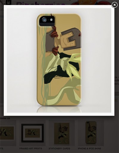 As a part of transmedia element of this module, I've decided to do a little experiment and upload few of the graphics I've created to my Society 6 store. First of all, I wasn't able to use all product options available via S6, since my frames had a specific size already and couldn't be enlarged to match their criteria. I've picked three different illustrations and posted them as prints and phone cases. Society6 filters do magic on these things, now I can see my little Cyclop looking hot on a fancy case ;)
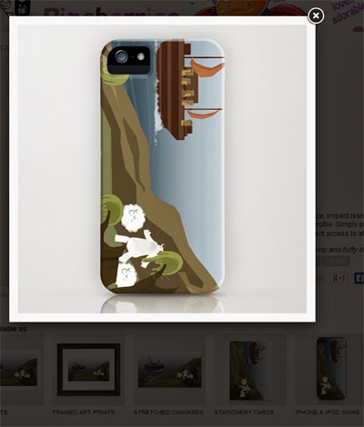 What's also interesting it got a little bit of attention.
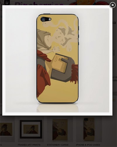 On another note, I've posted few frames on my other blog and in few facebook art groups and got a really nice feedback. As for a crit, colors being a bit too dull was a thing that someone pointed out. And, after looking at everything again, I have to agree with it, in some moments colors aren't as bright and vivid as they should. At least, for a title aimed at kids ;)
Tuesday, 25 March 2014
Backgrounds|Responsive
As I'm almost done with this project I've decided to share few animation frames.

 My main aim was to make them look cartoon-y and colorful, but also keep everything quite simple. As the target audience are mostly kids, it had to visually appealing. I've mostly used lasso tool to create different shapes and shaded it with one/two colors. I have a tendency to overcomplicate my drawings and get lost in painting tiny little details, which had to be stopped with this project. I also decided to change the style as a reason to step out from my comfort zone and try different methods and workflow. Moreover, creating backgrounds for animations is different to just painting a single artwork - style had to be consistent thru the whole one minute. Plus it needed to be clear and readable - viewer need to be able to recognize basic elements within few seconds (eg. tree, ship, characters).
It was definately a challenging project and although I'm not 100 % happy with it (I'm a perfectionist afterall) I have learnt a lot from it, which would be applied to the future projects. I'm thinking about practicing animation over summer and (hopefully) improve my skills ;).
It was definately a challenging project and although I'm not 100 % happy with it (I'm a perfectionist afterall) I have learnt a lot from it, which would be applied to the future projects. I'm thinking about practicing animation over summer and (hopefully) improve my skills ;).
Alien-Turntable|Machinima
Last part of the Biped Alien Task was creating an interactive turntable in Unity.
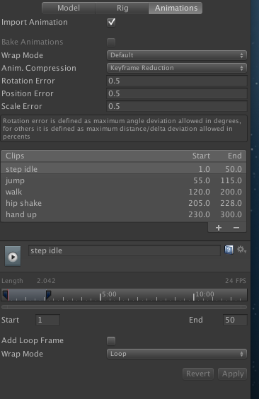
 I started by importing my alien model into the assets (animations were baked before exporting from Maya) and re-connecting textures with the mesh. I set animation type to 'Legacy', so it can be played and I set all my 5 different circles by typing frame numbers and names into a clips section in animations menu.
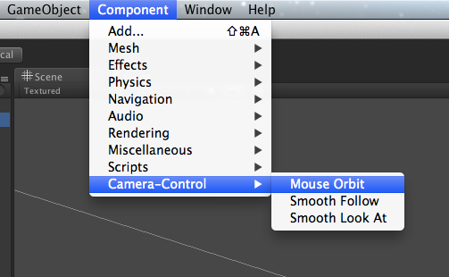
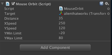 I've then created a camera and directional light. With camera, I've used Camera Components - Mouse Orbit option, so camera can orbitate around the model. I used an empty game object as a target for camera, as aiming on the model wasn't really working well for me.
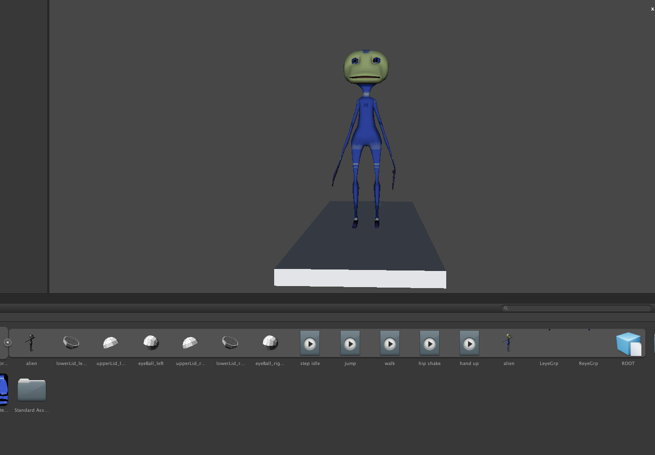 Next step was applying script to allow animations be played random. I copy-pasted script from eStudio, changed 'idle' to the relevant names for my character animations (var anims=new Array("step idle","jump","walk","hip shake","hand up"). I used MonoDevelop for changing Javascript, not Unitron, as it started to crash on uni computers. I then dragged script onto the character in hierarchy. And that's all. Whole process is fairly straight foward and quite enjoyable.
I saved my turntable as a standalone.

 I started by importing my alien model into the assets (animations were baked before exporting from Maya) and re-connecting textures with the mesh. I set animation type to 'Legacy', so it can be played and I set all my 5 different circles by typing frame numbers and names into a clips section in animations menu.
 I've then created a camera and directional light. With camera, I've used Camera Components - Mouse Orbit option, so camera can orbitate around the model. I used an empty game object as a target for camera, as aiming on the model wasn't really working well for me.
 Next step was applying script to allow animations be played random. I copy-pasted script from eStudio, changed 'idle' to the relevant names for my character animations (var anims=new Array("step idle","jump","walk","hip shake","hand up"). I used MonoDevelop for changing Javascript, not Unitron, as it started to crash on uni computers. I then dragged script onto the character in hierarchy. And that's all. Whole process is fairly straight foward and quite enjoyable.
I saved my turntable as a standalone.
Sunday, 23 March 2014
SnowdropEngine|Machinima
During this years Game Developers Conference (GDC) new engine was revealed. Snowdrop had been developed by Ubisoft Massive.
Snowdrop Engine, GDC 2014
Work started 5 years ago and in above video we are walked thru all the features of the new engine as well as what is capable of. Snowdrop is supposed to give creators more freedom and ability to prototype various ideas easily. It's a very powerful tool that will be used for at least few years.
Friday, 21 March 2014
AlienChallenges|Machinima
When final animations for alien character were done, I had to export it to Unity as DAE_FBX (or FBX) file type. However when I first tried to do it, it didn't work.
Problems:
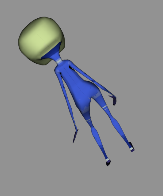
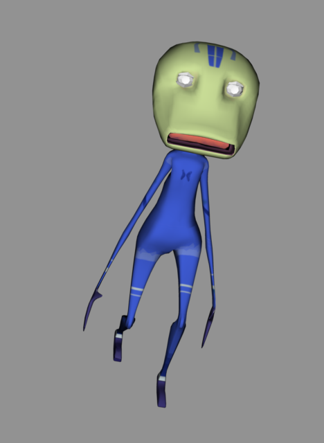 With above problems in mind, the best solution was detaching skeleton from the mesh, deleting history of smoothing from mesh and then attaching skeleton again with smooth bind. Had to paint weights again, but this time it was quite quick process as I did it before, I knew which areas of the model would be causing problems (mouth and head mostly).
Finally, my alien model works properly and as I'll be in charge of animating our characters I need to look up more reference for walks/jumps/idles.
Problems:
- textures - changed colors, model was semi transparent - this was fixed by changing a file from .png to .jpg and breaking connection of transparency control (Maya didn't changed setting automatically for .jpg file but left typical for .png alpha channels)
- model turning into a low poly version with missing faces and misplaced textures - this was caused by few things (and I basically did everything other way round). Firstly, I should delete history from model after smoothing it. This have to be done prior to binding and weight painting. Moreover I should UV map a low poly model and then raise number of divisions. I did UV map of smoothed mesh and when FBX file was exported it went back to it's original form. UV map for low poly was really messy as the Maya doesn't transfer that information backwards. What I've learn from it, is that: a) UV map needs to be done on low poly model b) smoothing have to be done before binding and history have to be deleted from the mesh.
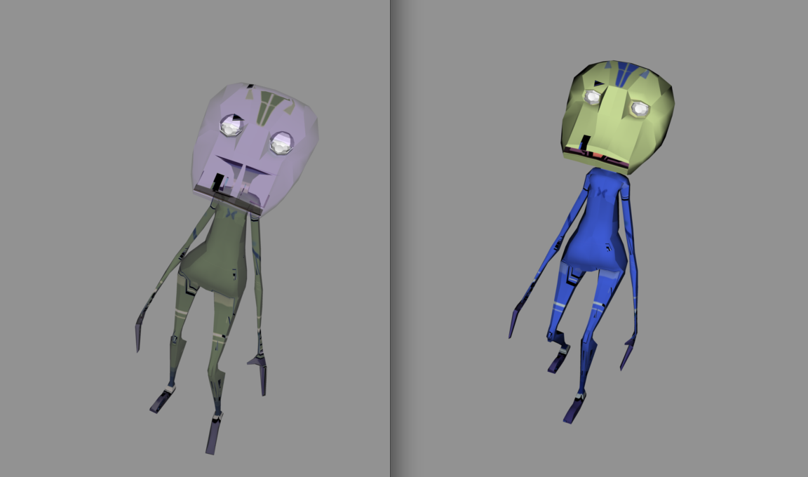

 With above problems in mind, the best solution was detaching skeleton from the mesh, deleting history of smoothing from mesh and then attaching skeleton again with smooth bind. Had to paint weights again, but this time it was quite quick process as I did it before, I knew which areas of the model would be causing problems (mouth and head mostly).
 Finally, my alien model works properly and as I'll be in charge of animating our characters I need to look up more reference for walks/jumps/idles.
Thursday, 20 March 2014
SnK Chibi Chara|Responsive
I've mentioned Shingeki no Kyojin few times already, but decided to look at it again. This time I want to talk about a mini series that was released right after first anime series. It concentrates on different events but still uses same characters as in main series. Style wise it's much more brighter and way funnier than original, which is quite grim and dark.
What I really like about Chibi Chara is a simple and colorful style. Backgrounds are usually filled with one color and outlined with thick lines (reminds me of vector art), characters are also very simple (and super deformed) with only one darker color used for shading. Moreover, all of the characters are made with a same 'base' - similar eyes and face/body shape. The only thing that helps viewer identify characters are haircuts (at this point I need to mention that in anime every character have different body/face shape). Style of animation is very cute and also really simple, which works perfectly with bright colors.
I've watched quite a few episodes already and I would try to apply this adorable style to my animation.
Tuesday, 18 March 2014
GamingPod|COP2
In previous post I've presented the finish concept art for the Gaming Pod idea. It was mostly inspired by different types of gaming chairs that are currently available on market and mixed with the concept of a motion tracking devices, that can monitor player movements. Inside the Pod will include a state of art gaming chair and thanks to the projectors that been built in, it could display image in 4K resolution. Games would be more interactive and immerse, since there will be no actual controllers to hold and use, as AI of a game engine would interpret not only body movements of its user, but also create a game environment based on a emotions of its user. This hypothetical function could be possible to turn off if player doesn't wish to have his own emotions monitored. However, when this particular function is left on, game world could change, from let say, cheerful and colorful platformer game world, to grim and scary corridors of a horror. It definitely would be an interesting device to use and, even though it sounds very sci-fi, it could be possible in the future.
Monday, 17 March 2014
Shingeki no Kyojin Subaru Ad|Responsive
Last year, in a blog post about transmedia, I've mentioned Shingeki no Kyojin (Attack on Titan). Few months later, and with constantly growing fan base (especially in Japan and Korea), Subaru decided to create a rather unusual ad for Forester car.
To people, who have no idea what Shingeki no Kyojin is, this short spot that were aired on japanese TV (and we need to remember, they do have a lot of weird ads), can be very confusing and simply stupid. Action of manga takes places in this fantasy world, that have traces of medievil Europe, were for 100 years human kind were hinding behind giant walls from creatures simply known as Titans. With this being said, it's almost impossible to make a piece of video that could promote a modern car and still make sense. Nethertheless, it made fans of this manga extremly happy and possibly let to increased sales of Subaru cars. It also started a various memes and speculation, including making an action feature film (rumors mention 2016 as release date).
Therefore, SnK is a prime example of piece of transmedia that expands in many different directions (and we could understand countless games, anime season, OAV, spin-off mangas).
Could games be as good as movies?|COP2
As part of this module we were asked to write a review of texts - minimum
500 words.
In this short essay I have decided to look at fragment of text that comes from book titled Trigger Happy: the inner life of videogames by Steven Poole. He is a British journalist and author, had publications in many newspapers, e.g. The Guardian. Currently he is writing a monthly column in the Edge magazine along with some online publications. With that being said, we can consider him as specialist (or perhaps more practitioner?) in technologies and games.
Trigger Happy was published 14 years ago, which, with fast technological improvements, make it a bit out-dated. It is good book for basic information’s on videogames, history, but there are few statements that could easily be argued. My main problem with it was where author doubts in the fact that games could be as good as movies.
Nowadays, with eighth generation of consoles available in stores, we are used to beautiful graphics and complex stories. Vast, open game words require years of work from hundreds of people - artists, animators, scriptwriters, programmers, and developers. Moreover, the cost of production and promotion is nearly same as the money spent on making a Hollywood movie. Grand Theft Auto 5 could be a perfect example; it cost roughly £170 million, which made it the most expensive game in the history. It also was a fastest selling game in many countries, with over 32 million copies sold worldwide.
However, GTA V created a lot of controversies with it's violence and, apparently sexist, story. Yet, blaming a game, that for years concentrated on gangsters and bank heists, for violence it's at very least ridiculous. It is like blaming Saw, horror movie series, for glorifying pointless gore and tortures. Nethertheless, there are other games that also had an international success. Beyond: Two Souls is a game developed by Quantic Dream and its genre could be described as an interactive drama action-adventure. Similarly to previous games created by David Cage studio, Fahrenheit and Heavy Rain, players main task is to watch wonderfully rendered cut scenes and enjoy interesting and engaging story. In Beyond: Two Souls motion capture technique were used to film actors and collect enough data for animators. Ellen Page plays role of Jodie and Willem Dafoe is Nathan Dawkins. Typically for Quantic Dream titles, player is a mere observer and actual gameplay is limited to needed minimum. With it's amazing visual, Beyond reminds more of interactive film than actual game. In this sense, it's innovative and unique, but sparked a large discussion on forums and in magazines. The question that need to be asked, is whenever or not, productions similar to Beyond, should be still games, even with a lack of actual gameplay. Every move made by player outside the scripted and carefully planned story, ruins an illusion of open world.
Summarising, with today’s technologies, games can possibly be as good as movies. From graphic point of view there is not that much difference (if there is any) between these two, same goes for interesting stories that are being told across these two platforms. It's down to players to decide which game do they prefer and what their expectations are.
GTA V|Machinima
Sunday, 16 March 2014
GamingPod Conceptart 2|COP2
Second concept I've created was a GamingPod - capsule seat with high end projectors and motion sensors built in.
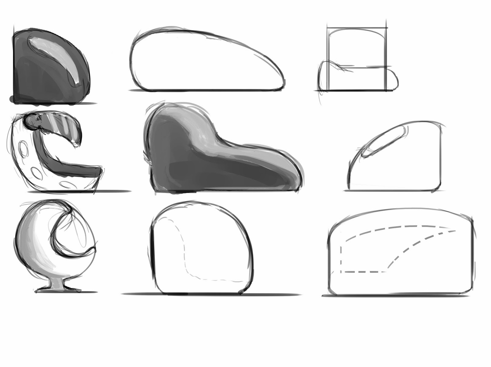 I've started with loose thumbnails which helped me with finding a right shape. I tried to keep my design organic and futuristic. After creating 9 different ideas I chose one and worked a bit more on it.
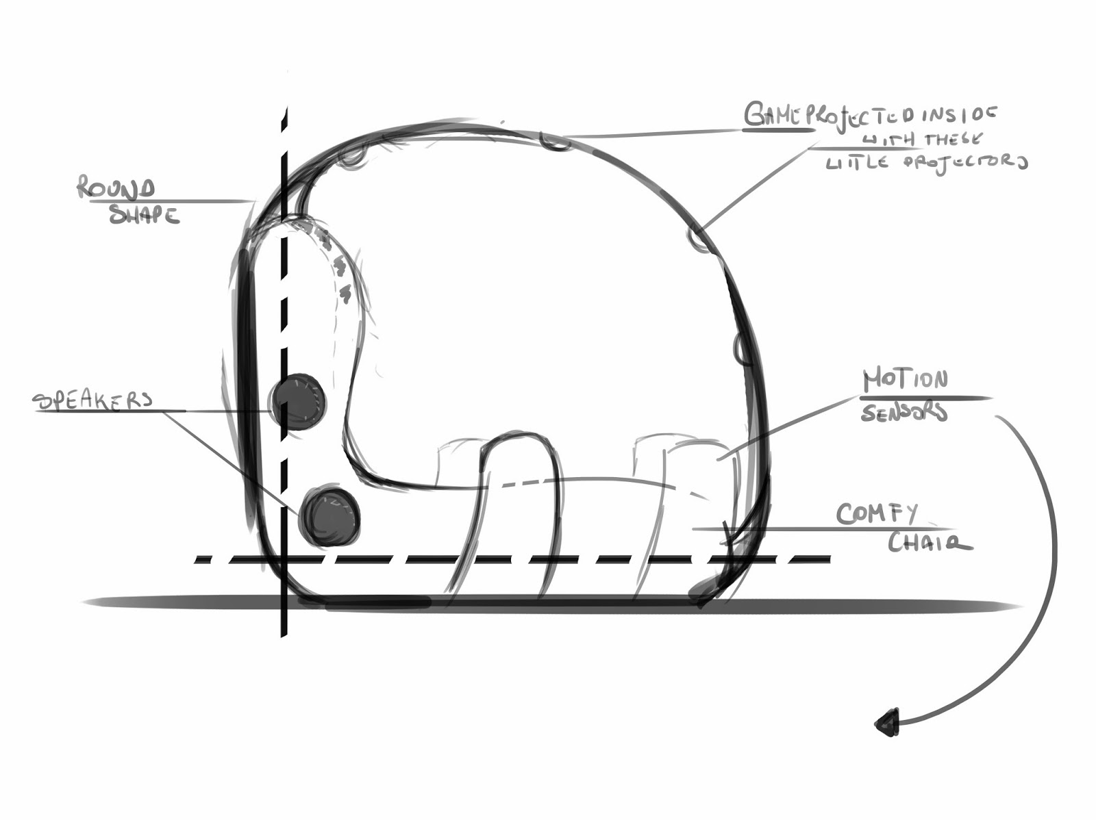 With this one, I've added details of how it could look inside as well as noted some of the features that could make this work. Again, I kept everything fairly simple and loose.
 Last step was to create a finished design, cut-out and front view. With this one I kept everything neat and presentable. I've also added set of arrows to point out key features of GamePod.
 I've started with loose thumbnails which helped me with finding a right shape. I tried to keep my design organic and futuristic. After creating 9 different ideas I chose one and worked a bit more on it.
 With this one, I've added details of how it could look inside as well as noted some of the features that could make this work. Again, I kept everything fairly simple and loose.
Friday, 14 March 2014
Transmedia Essay|Responsive
Transmedia
Essay
For
this module I’ve decided to create a one minute long 2D animation
that could be submitted to a film or animation festival. As final
piece is simple and colourful, with adorable characters, it target
audience would be mostly children. One of the tasks we were asked to
do, was to, hypothetically, think how we could expand our projects by
additional media – e.g. games, comics, plushies, etc.
The
story is loosely based on a Greek mythology and one of the Illiad
poems, written by Homer. This project was also an extension of a work
I did during Access to HE course couple years ago. In a sense, this
short animation is already a piece of transmedia, an extension of an
existing work. For this project I had to revisit all major elements,
like character and beast designs, style, re-write script to make it
more suitable for animation (as work I did earlier was in a comic
format). The style also slightly changed also this time I wanted to
make my final piece bright and colorful. I’ve decided to change
story a bit and make it more relevant to today’s times. Also I
wanted to aim it at young children so had to avoid violence and any
type of gore scenes.
This piece of animation
concentrates on a specific task that is performed by a main character
(Odysseus) and his crew. However, other side quests are mentioned in
this animation – in a form of photos. That way I’m able to expand
it to a series of short stories, that will explore different events
that happens to characters. There are enough points in the plot of
this animation, which could be used as a starting point for new
stories. There is no explanation on why Odysseus started his unusual
quest or why he got so interested in taking selfies and not doing
something else. Moreover, this animation could be interpreted as an
ending of a whole set of stories, as Odysseus presents his other
achievements.
Exploration
of other characters and their stories could be another route to take.
It is a popular trend lately, with games like Last
of Us,
releasing a DLC, which concentrates on a different character or
event. Also, with stories like that, the time period between a main
and additional event happens is short and easy to understand by
viewer.
Since my first animation is
loosely based on a Greek mythology, an each seasons of series could
happen in different time periods or be based on different set of
myths or believes. A good example could be transferring an existing
system to the world of a Norse mythology, with Loki (he is a bit of
mischievous character) travelling across vast dimensions and taking
selfies with, e.g. fenrir. Additional content could be created by
spin-off series, were characters from various mythological words meet
together. A good examples of that can be Avengers movies, where
superheros from different comics (in a sense brands of its own) fight
evil, or a recent Doctor Who episode that involved all Doctors in one
quest.
Futher content could also
concentrate on explaining historical events in fun and interesting
way, a little bit like a Horrible Histories. Overall idea
would stay same, but seeing kings and knights getting obsessed with
technology thats typical for our time, could be rather interesting to
watch.
With it colourful style,
this story could be also made into a series of comics – either
short, 3-4 panel strips or a book with full page layouts. It could
also be transformed into a visual novel or motion comic.
This story could also be
used for creating a set of colouring books, aimed mostly to young
kids. Set of a book that explains basics of math or teach children
alphabet would be possible and well suited within existing style and
world. It even could be easily turned into a clickable and
interactive book app for children, that can be released on tablets,
since most parents give their kids devices like really early.
Another
media that this piece could be transferred to are browser or mobile
games. As mentioned before, aesthetics of this work allows making it
into a funky, quick game, similar with its style to
Angry Birds or
LocoRoco.
It also ties up nicely with the previous idea of educational book
app.
The merchandise, like a
plush toy and a set of figurines, could be another idea for a world
extension. Moreover, items like that can be made quite easily with a
use of websites like Society 6, and would reach wider audience.
Society 6 not only help with selling prints and stretch canvases, but
allows users to put their work on mugs, t- shirts, hoodies, phone and
laptop cases, clock and, quite recently, shower curtains. It also
takes off the pressure of finding the right print house or factory
from the author, especially if it is made only on a small scale.
After
looking at all these ideas I'm confident with the potencial that my
little project have as a piece of transmedia. It was a good exercise,
planning and thinking about these other venues that could create an
additional fan base. Moreover, I'm hoping to actually expand this
Cyclop versus Odysseus idea a bit futher and transfer it into other
platforms, wherever it's motion comics or a very basic game.
Character concept2|Machinima
Follow up to the previous post (in which I shown various thumbnails). After consultation with Elliot and Kath we agreed, that a 'tall alien' will be a cross between numbers 2 (because of eyes) and 9 (overall silhouette), and 'chubby alien' - 1, 8, 10 and 19.
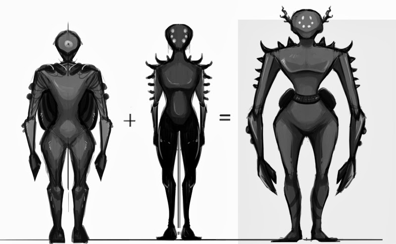
'Tall alien' (Captain) development - I've made him a bit taller than the two previous versions. Initially I wanted to keep spikes as a part of his uniform, but after another consultation with other team members we agreed on getting rid of them. Moreover, I've added little horns/antennas on side of his head, belt with pouches and tried to keep his uniform design to look military and show his status (general, captain of this ship)
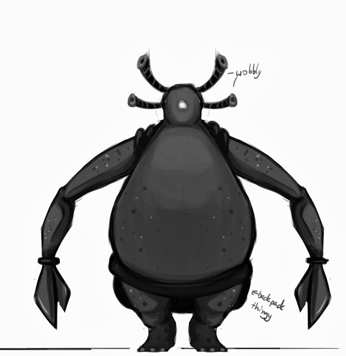 'Chubby alien' (for some reasons I like to call him Blob) development - no futher iterations needed. With this designs I've tried to adapt various elements from other designs - e.g. dotty patern on his skin, pear-shaped body, antennas, big claws. Blob is a much more lower rank alien, which manifests thru his lack of proper clothing (basically he is naked, expect for the belt-bag), probably one of ship engineers. His antennas are more like actual corals and wobble as he walks around.

Final designs and size comparison. It is also a final design for Captain.
Orthographic views for both aliens. Since Captain is more important and advanced, he wears a special back pack and helmet that filtrates air and also gives him all needed nutritions. Blob doesn't have mask, air is filtrated thru wobbly antennas and he have to carry his tools and food in backpack and pouches.

'Tall alien' (Captain) development - I've made him a bit taller than the two previous versions. Initially I wanted to keep spikes as a part of his uniform, but after another consultation with other team members we agreed on getting rid of them. Moreover, I've added little horns/antennas on side of his head, belt with pouches and tried to keep his uniform design to look military and show his status (general, captain of this ship)
 'Chubby alien' (for some reasons I like to call him Blob) development - no futher iterations needed. With this designs I've tried to adapt various elements from other designs - e.g. dotty patern on his skin, pear-shaped body, antennas, big claws. Blob is a much more lower rank alien, which manifests thru his lack of proper clothing (basically he is naked, expect for the belt-bag), probably one of ship engineers. His antennas are more like actual corals and wobble as he walks around.
Final designs and size comparison. It is also a final design for Captain.
Orthographic views for both aliens. Since Captain is more important and advanced, he wears a special back pack and helmet that filtrates air and also gives him all needed nutritions. Blob doesn't have mask, air is filtrated thru wobbly antennas and he have to carry his tools and food in backpack and pouches.
Alien_workshop02|Machinima
Last step I had to do in order to get my alien moving was to create a rig and bind it to the mesh. I had played with joint tool and IK handles before and was fairly familiar with the tools, but still learnt a lot in a process.
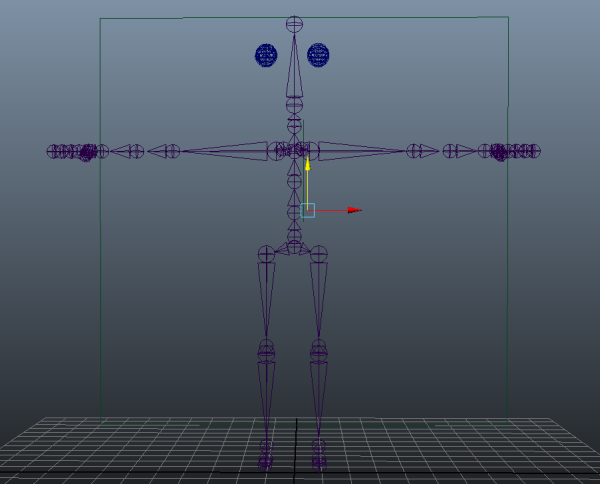
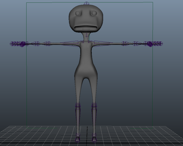 First, I've created a joint chains that served a skeleton.Leg rigs are using IK (inverse kinematics) and arm are FK (foward kinematics). I've added extra joint in forearm in order to make more natural looking movement when twisting arm (we don't have this joint, but in 3D software you sometimes have to change few things). Next step was creating custom controllers (eg. feet, hands) with Nurbs and CVs.
Attaching joints to mesh - binding. Fairly straigthfoward, used smooth bind option. Painting weights and taking influence off from end joints was next (except for brow joints) and was time consuming but necessary.
After that I was finally able to keyframe my animations. I did 3 different idles, a walk and a jump animation, which I exported as FBX file. Used Unity to cut footage and a script made by Anabeth to put my alien model on a nice mirror pedestal.
Sunday, 9 March 2014
Alien_UVmapping|Machinima
After I've finished modelling, next step was to UV map and texture my alien. Since we are going to use final animations in Unity (and Unity doesn't particulary like FBX files), I had to smooth my alien model (Mesh>Smooth) beforehand.
Suprisingly UV mapping wasn't as difficult as I expected. Hours of hard work last year payed off. I mostly used 'cut UVs' and 'unfold' options (but also tested the 'relax' options which came handy.. also had to flip inside mouth UVs). The only problematic areas were feet and head. I'm quite happy with final result - it's quite easy to understand map, only feet look a bit weird since I tried to different methods. Hands however were fairly straight foward job, with only few UVS overlapping around thumb area (but easy to untangle).
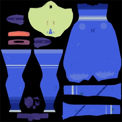 I've also watched this basic tutorial on UV and Texturing, really good refresher. Moreover I found UV mapping somehow a peaceful and rewarding activity. Afterall that hard work I was able to 'dress' my alien and make it look a bit prettier;).
I went for bright, bold colors and hand drawn detail. I'm pleased with final outcome (below), made one crazy alien ;).
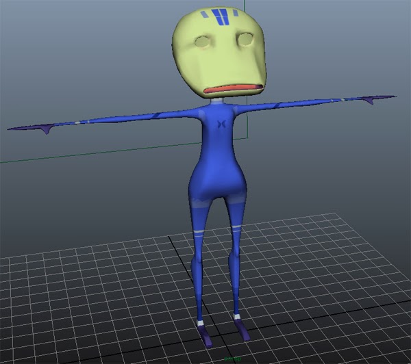
Suprisingly UV mapping wasn't as difficult as I expected. Hours of hard work last year payed off. I mostly used 'cut UVs' and 'unfold' options (but also tested the 'relax' options which came handy.. also had to flip inside mouth UVs). The only problematic areas were feet and head. I'm quite happy with final result - it's quite easy to understand map, only feet look a bit weird since I tried to different methods. Hands however were fairly straight foward job, with only few UVS overlapping around thumb area (but easy to untangle).
 I've also watched this basic tutorial on UV and Texturing, really good refresher. Moreover I found UV mapping somehow a peaceful and rewarding activity. Afterall that hard work I was able to 'dress' my alien and make it look a bit prettier;).
I went for bright, bold colors and hand drawn detail. I'm pleased with final outcome (below), made one crazy alien ;).

Labels:
alien,
DFGA,
Leeds College of Art,
machinima,
maya,
OUDF505,
UV texture
Kath Shackleton Talk|PPP2
Kath Shackleton from fettleanimation.com gave us a very interesting and insigntful talk into the world of animation. She is an animation producer and her job is mostly about managing team of people, providing them with schedules and pitching for new work opportunities. Here's some notes I took during the talk.
Thursday, 6 March 2014
Storyboard|Responsive
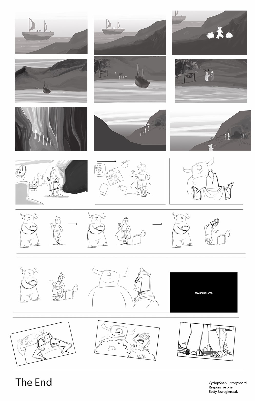 Storyboards for my one minute long animation.
 As I've got only 3 weeks left to make it (simulating a real life work situation, huh), I had to plan my shots very carefully. Mostly using still images of environments (with little animations done in After Effects) and some character animations, which will have to be drawn in Photoshop. Moment, when Odysseus is showing photos to Cyclop is tricky scene and it might look different in final animation (so far I just thought about a series of pictures and camera panning around them).
Sound is another thing I have to consider very carefully, as I don't want to record any dialogues. Mumbling sounds, environmental noises, waterfall splashes should be enough.
Wednesday, 5 March 2014
GamingPod Conceptart01|COP2
For the digital artefact (which is a part of Context of Practice 2), I've decided to draw a range of concepts that will illustrate a future gaming devices.
 First concept I did presents a gaming headband device, that allows user to enjoy his/her favourite games wherever/whenever they like. Micro projectors are located inside the headband and project picture in front of a person. Range of motion sensors are also located along the strap of a band, which tracks the body movements, interpret and transfers them into the game. Thanks to that technology, every body movement is instantly processed and effects played game in real-time.
Although, I'm creating concepts for future gaming devices, many of these technologies are already available. Oculust Rift, Leap Motion sensor, Kinect and Playstation cameras all makes these ideas close to reality and actually quite possible to achive in near future.
Labels:
concept art,
COP2,
DFGA,
Leeds College of Art,
OUDF501
GamingPod Ideas|COP2
For the practical element, that responds to the theme/issue dicussed in a 3000-word written essay, I've decided to draw a series of concepts, which will present a future gaming device. Below I've decided to list artwork that will definately inspire my final concepts.
One of the main inspirations was a illustration created by Xavier Houssin. Although, it presents a futuristic tablet, that artists could use for painting, I really liked the idea of interactive pallets and multiple screens ''floating'' around.
 Another interesting concept around this theme was done by Lois van Baarle. What I personally really like about it are the moody, grim colours pallete and great attention to detail (all these pipes, cables and buttons).
 A series concepts done by Jaroslaw Wasileski for Artbuzz Challenge 2013 is probably closer to what I'm trying to create than two images included earlier. First of all, they're presetned in a really neat, profesional way. Second reason is that visually they're closer to what I want to draw. Even thought it's another drawing device from the future, I really like some of these design solutions, which could be applied to my project.
 Last piece I wanted to included is actually another entry for Artbuzz Challenge 2013, but this time was done by Magdalena Mudlaff. Her idea was to create a futuristic chair that uses nano technology to communitacte with user. These concepts are very organic and could blend easily with usual living room furniture.
One of the main inspirations was a illustration created by Xavier Houssin. Although, it presents a futuristic tablet, that artists could use for painting, I really liked the idea of interactive pallets and multiple screens ''floating'' around.
 A series concepts done by Jaroslaw Wasileski for Artbuzz Challenge 2013 is probably closer to what I'm trying to create than two images included earlier. First of all, they're presetned in a really neat, profesional way. Second reason is that visually they're closer to what I want to draw. Even thought it's another drawing device from the future, I really like some of these design solutions, which could be applied to my project.
Labels:
concept art,
COP2,
DFGA,
Leeds College of Art,
OUDF501
Character concept art|Machinima
Bunch of character thumbnails for Machinima brief.
I was trying to take as much inspiration from sea creatures as I could. Also tried to make as many various designs and unique silhouettes as I possibly could.
Our brief states, that we need to have two characters, therefore I played with different body shapes and sizes. Last year I've learnt a very handy method of making various designs by drawing only a half of a concept and mirroring another half. It's very good way of creating, for example, aliens.
Tuesday, 4 March 2014
The Lego Movie - is it really that awesome?|PPP2
The Lego Movie (2014) is a animated adventure comedy film, based on the Lego line of toys. Theatrical released happened at the begging of February and movie became a success, praised by many critics for great humor and really good animation.

Animal Logic tried to replicate a unique feeling of stop-motion animation by using a computer generated footage. There has been many stop-motion films that used Lego bricks, but it was first time for 3D softwares to replicate the way they behave.
I really enjoyed the way The Lego Movie was done, in terms of animation it looks really good. However I only enjoyed half of the story, as I felt adding human characters to the film ruined the mood. I was perfectly fine with fantasy world of Lego, without any explanation or attempts at making it more serious. Nevertheless, it was a very enjoyable film.
Monday, 3 March 2014
RabbitPortalTalk|PPP2
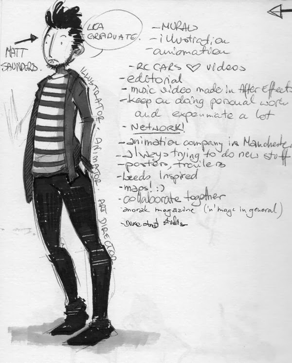 Last friday we got opportunity to attent talk by Matt Saunder, past Leeds College of Art graduate. It was a very interesting and useful talk; I've scanned notes and a little silly drawing of Matt ;) (he actually liked it).
Sunday, 2 March 2014
Guacamelee!|Machinima
Guacamelee! follows the path of Juan, during the game player will encounter many colorful enemies and travel thru beautiful locations. This game is also quite funny and challenging.
Guacamelee! art style is consistent and both gameplay and cut-scenes are really cartoon-y and colorful. Character sprites are also really good and animations run smoothly. Juan's special attacks also look awesome. Overall, it's a very good and beautiful game.
Subscribe to:
Comments (Atom)


